

Somewhere in your Shopify dashboard, there's a number that claims to be your customer lifetime value.
Maybe it says $120. Maybe $180. It sits there looking precise and authoritative, and most brand owners glance at it and move on.
Don't make the same mistake.
Because that number is a blended average — every customer you've ever acquired, stirred together.
The woman who's bought from you eleven times in two years and the guy who grabbed one thing on a whim last Tuesday.
They get the same weight. The result is a figure that describes nobody in particular and misleads you about everyone.
What you actually need to know is simpler and more useful: of the customers you acquired in a given month, how many came back and bought again?
And how does that repeat rate hold up — or fall off — as the months go on?
That's what a cohort analysis gives you.
And the data to build one is already sitting in your Shopify reports.
This post shows you how to pull it out and turn it into a lifetime value number worth making decisions with.
We also built a free LTV model template that does most of this math for you — paste in your Shopify export and it handles the rest. More on that at the end.
Before You Start: You Need History
This only works if you have enough data.
The more months of order history you have, the more reliable your retention curve will be.
At minimum, you want 12 months.
That gives you enough cohorts to see real patterns and enough time depth to understand how customers behave beyond their first few purchases.
If you have 18 or 24 months, even better. If you have less than a year, you can still run the analysis — just know that your later-month estimates will be thin.
1. Pull Your Cohort Data from Shopify
The first thing you need is data that Shopify doesn't surface on its own — at least not in a useful format.
You need a report that shows you, for every month, how many new customers you acquired and how many orders those same customers placed in each month that followed.
Not total orders. Not total customers. Orders broken out by the month the customer was first acquired.
So if you acquired 3,309 customers in May, you want to see how many of those May customers ordered again in June, July, August, and every month after.
The easiest way to get this is through Shopify's Reports section.
You can run a custom report query, export it as a CSV, and you'll have everything you need.
One export, a few seconds of work. That's your raw material.
2. Read Your Cohort Table
Once you have that data laid out, it looks like a grid. Each row is an acquisition month. Each column is how many months have passed since that first purchase.
So you might see that in May, you acquired 3,309 new customers. In June — one month later — those same May customers placed 659 orders. In July, 464. In August, 336. And so on, tapering down.
If you've ever seen a cohort chart, this is it — just in spreadsheet form.
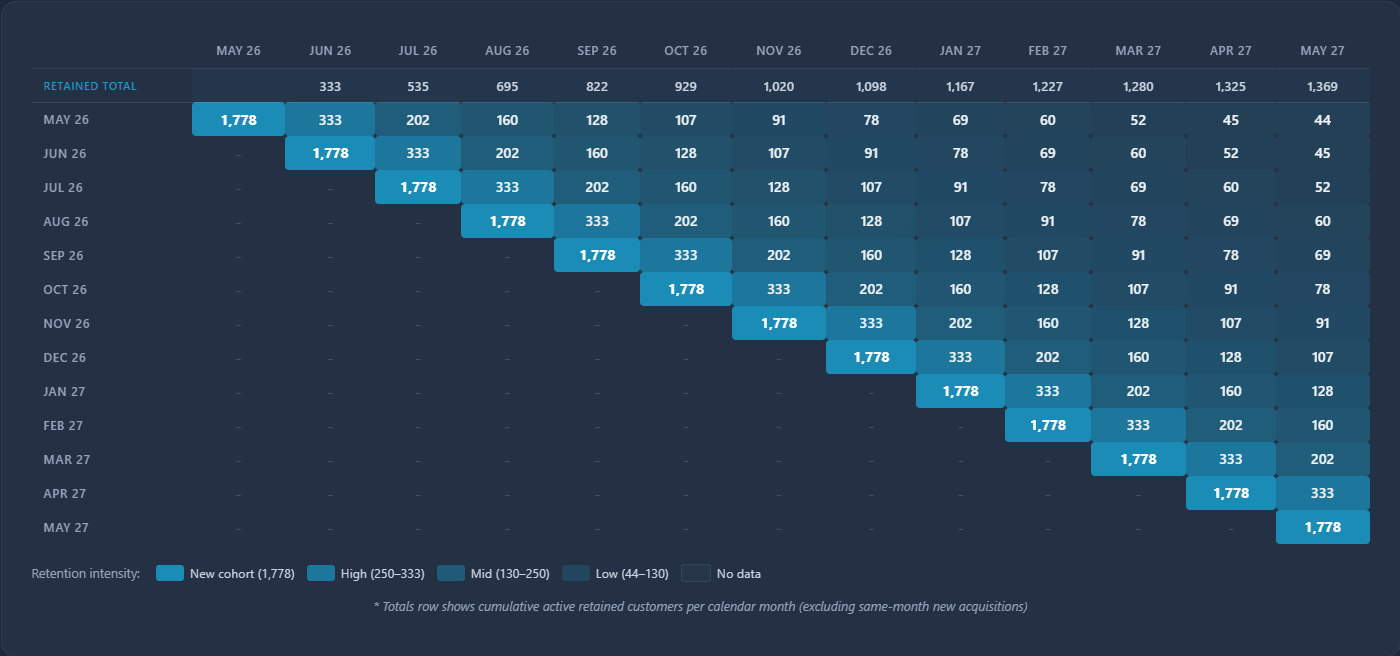
Every row tells the story of one group of customers, from the month they found you to wherever they are today.
3. Convert to Percentages
Raw order counts are useful, but they don't let you compare cohorts against each other.
A month where you acquired 5,000 customers will always have bigger numbers than a month where you acquired 1,200 — that doesn't mean the retention was better.
So you convert the whole table to percentages. Instead of "659 orders in month one," you see "21% of May customers came back in month one." Then 13% in month two. Then 10% in month three.
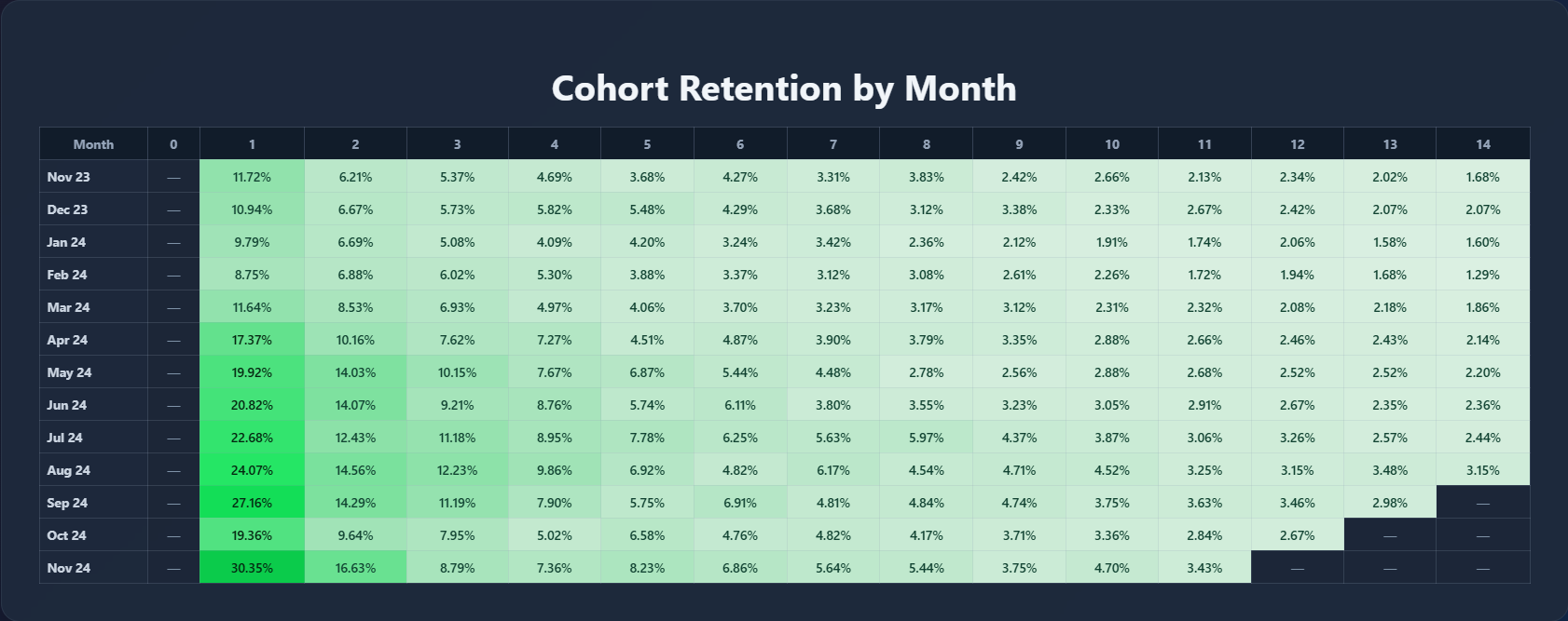
Now you can actually compare. You can see which cohorts retained better than others.
You can spot if something changed — maybe the customers you acquired in September had a noticeably higher month-one repeat rate than the ones from March. That's a signal worth investigating.
4. Average vs Weighted Average
Once you have percentages across a dozen or more cohorts, you need to distill them into a single retention curve — one set of numbers that represents your best estimate of how a typical customer behaves.
The obvious move is a simple average. Add up all the month-one percentages, divide by the number of cohorts. Easy.
But it treats every cohort equally, and that's not always honest.
If January 2024 brought in three times more customers than January 2025, the behavior of that larger cohort is a better reflection of your business.
A weighted average accounts for that — it gives more influence to months where you acquired more customers.
The difference between the two isn't always dramatic, but when it is, you want to know.
Default to the weighted average and only override it if you have a specific reason to.
5. When to Adjust the Numbers
This is where you have to be honest with yourself.
Your weighted average gives you a retention curve based on all your historical cohorts.
But what if your business changed six months ago?
Maybe you overhauled your post-purchase emails, launched a subscription, or improved your product.
Your recent cohorts might be retaining at 17% in the early months while your older ones sat around 6%.
The problem is that only those older, weaker cohorts have been around long enough to show you what happens in month 12 or month 18.
So your long-term retention numbers are anchored to a version of your business that may no longer exist.
It's reasonable to adjust for that.
If your early-month retention has clearly improved across your last several cohorts, it's fair to assume some of that carries through to later months.
But "some of that carries through" is not the same as "we changed our packaging so retention will probably double."
One is grounded in data. The other is wishful thinking. Know the difference.
6. From Retention Curve to Lifetime Value
Now you have a retention curve you believe in. This is where it becomes a lifetime value number.
You take that curve and layer in a few more inputs: your average order value for new customers, your average order value for returning customers, and your gross margin.
The retention curve tells you how often customers come back.
The AOV tells you how much they spend when they do.
The gross margin tells you how much of that you actually keep.
With those inputs, you can calculate your customer lifetime value at different time horizons — 3 months, 6 months, 12 months, 24 months.
Not a single blended figure, but a number that grows over time as repeat purchases stack up. That's the real LTV.
7. Why Lifetime Gross Profit Matters More Than LTV
Here's where most brands stop — and where the sharper ones keep going.
Lifetime value is a revenue number. It tells you what a customer spends.
Lifetime gross profit tells you what you keep after cost of goods.
The difference between the two is the difference between making decisions based on revenue and making decisions based on money that's actually yours.
Consider two customers.
One has a $200 LTV with a 30% gross margin — that's $60 in lifetime gross profit.
The other has a $150 LTV with a 55% margin — $82.50 in lifetime gross profit.
The "lower value" customer is worth more to your business.
This matters most when you're setting your CAC target.
Your ceiling isn't your LTV. It's your LTGP.
If your lifetime gross profit is $99 and you're paying $100 to acquire a customer, you are losing money — even if the LTV number looks healthy. LTGP is the number that tells you the truth.
This is where the free LTV model template comes in — it calculates both LTV and LTGP at every time horizon, straight from your Shopify cohort data. If you want to see these numbers for your brand, [link to template].
Putting It Together
The process, start to finish:
- Pull your cohort data from Shopify
- Lay it out as a grid — acquisition months by months since first purchase
- Convert to percentages so you can compare cohorts
- Weight your averages toward your larger cohorts
- Adjust for recent improvements if the data supports it
- Layer in AOV and gross margin to get LTV and LTGP
- Use LTGP — not LTV — to drive your acquisition decisions
None of this requires anything exotic. The data is already in your Shopify reports. It just needs to be structured in a way that lets you actually read it.
We built a free LTV model that handles steps 2 through 7 for you.
Export your Shopify data, paste it in, and it calculates your retention curve, LTV, and LTGP across every time horizon. Grab it here.


.jpg)


.jpg)
